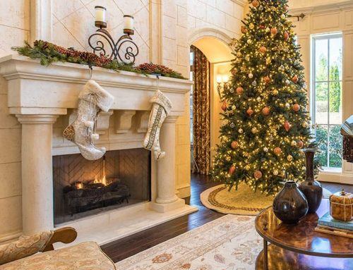
Annandale
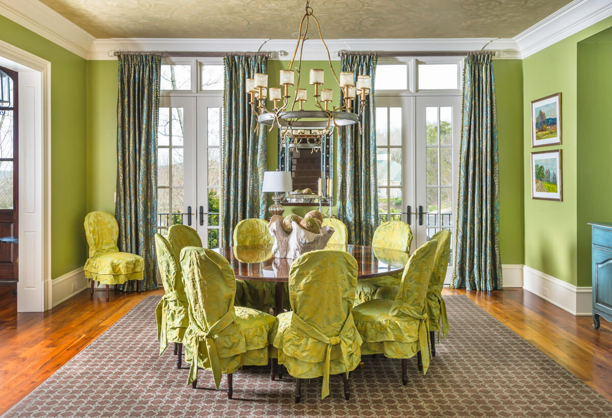
The walls in this stunning dining room were already painted apple green when I came in on the project as the client’s personal interior designer in Brentwood, Tn. My client loved bright colors and bold patterns. They were way ahead of their time when everyone in the Nashville market was wanting white or grey walls. Since the Covid shutdowns when everyone was stuck in their house for months or years looking at the same bland walls things have changed in the interior design world. Color is everywhere now! Bright colors, mixing colors, and patterns, there is nothing boring about this interior design trend. The sky is the limit and your imagination is my palate!
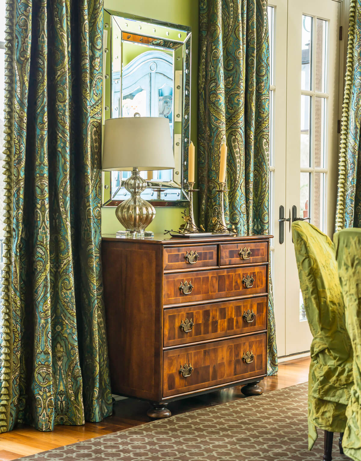
This turquoise and apple green silk paisley fabric I found for the custom made window treatments is to die for! It serves to bring everything in the room together, from the walls, to the turquoise hutch, the rug and the art on the walls. All of the colors come together here, in the eyes of the room.
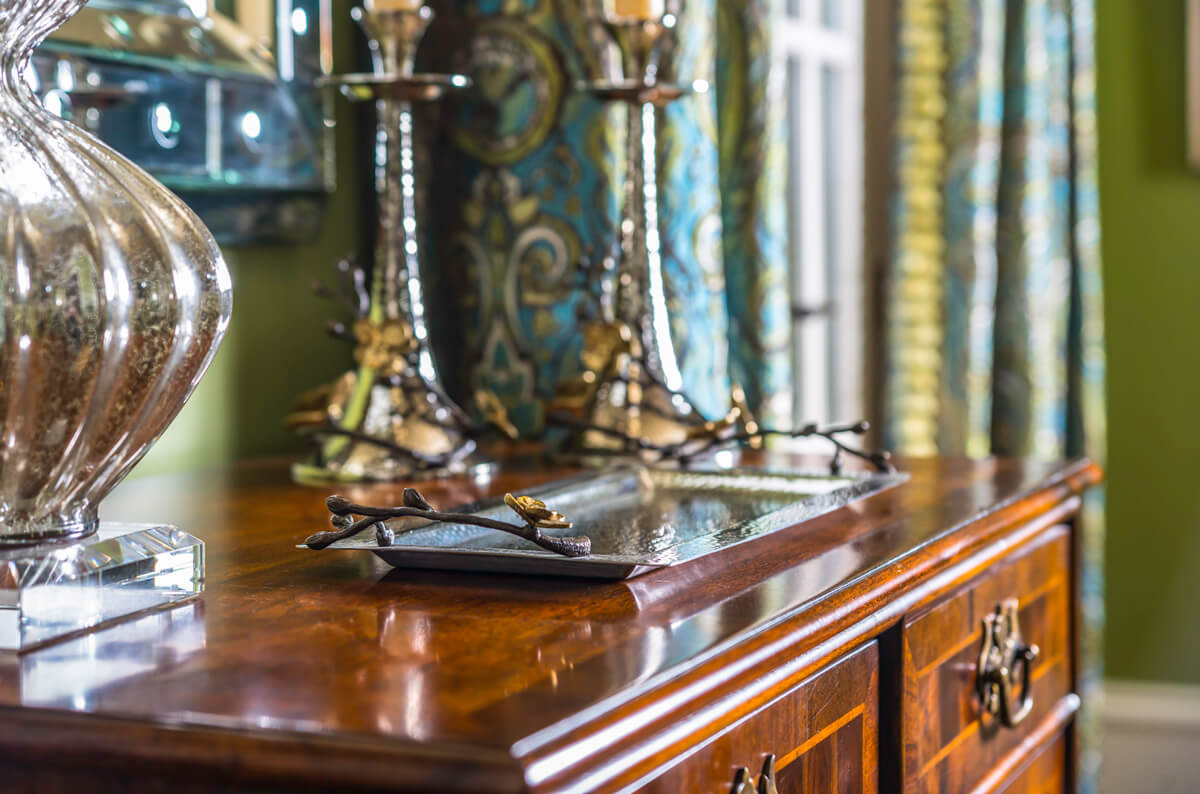
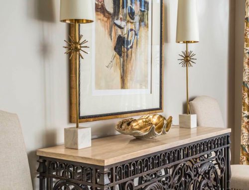
I love mixing the old with the new. This antique chest between the windows of the dining room gives the feeling of nostalgia. The transitional hammered metal tray with birds and the mica glass lamp and candlestick holders bring a modern touch and accent the room perfectly. Accessories are the finishing touch to a room to complete the look.
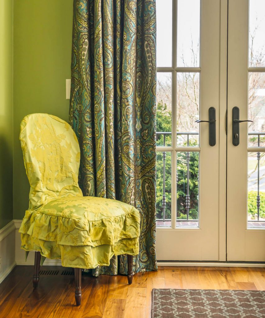
The Sherrill dining room chairs are covered with and apple green damask seer sucker fabric with a double skirt and ties in the back. This adds another layer of fabric to make the dining room cozy and interesting. Details like this are essential for a well-designed space.
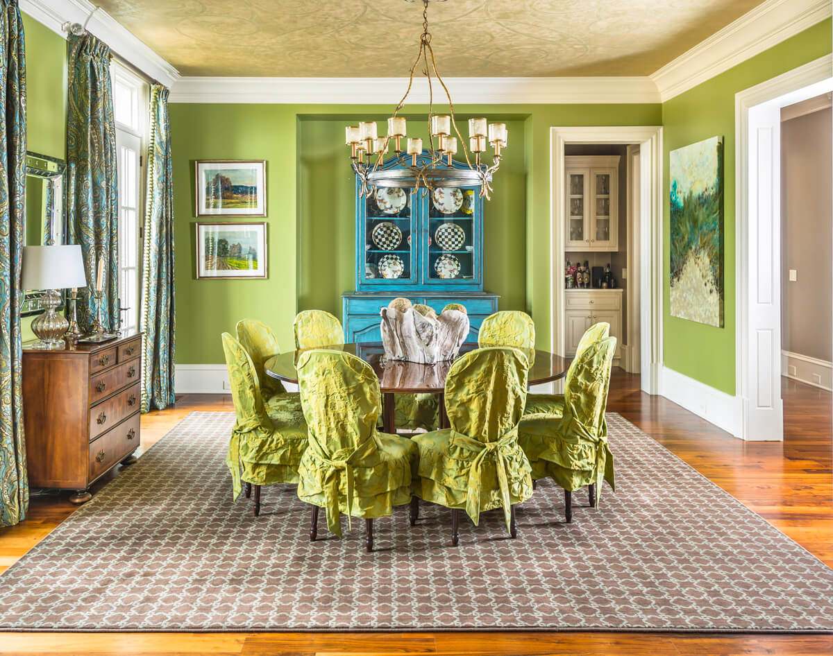
Everything is pulled together in this whole room shot of the Brentwood dining room. I found this turquoise hutch on the floor of a designer showroom. It was the perfect piece to add another layer of color to the room. The window treatment fabric was the next find along with the art to marry the green and turquoise seamlessly into the room.
The round mahogany dining table is purposeful to the square shape of the room itself, as well as the perfectly square rug that was custom-made and bound. The transitional round chandelier mirrors the shape of the table and brings contemporary and traditional styles together with its finishes and shades.
The petrified wooden bowl in the center if the table with the moss balls cradled inside is the perfectly unexpected finisher atop the table. Details details details!!!
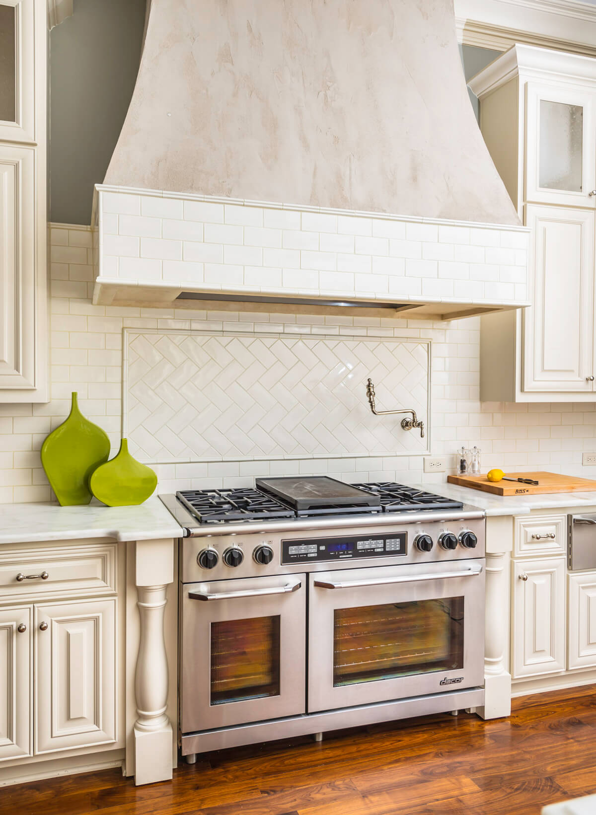
We re-painted this kitchen from the old glazed trend to a cleaner, more crisp off-white. The backsplash was tumbled marble replaced by a simple subway tile and a herringbone pattern under the vent hood. The green flows in from the dining room in these contemporary accent jars that sit under the plastered finish if the more traditional vent hood.
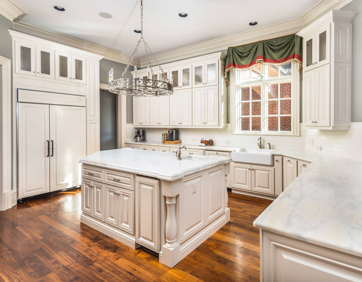
We decided to make the dated kitchen as neutral as possible with this off white paint colors because the house was going to be put on the market. The new owners can bring in accents on the newly installed white marble countertops, to the window treatments, and maybe add some rugs to the walnut finished hardwood floors. There is tremendous potential in this kitchen for someone to come in and make it their own with very little effort. We did all of the major renovation for them. Sometimes putting money into the house to make more out of it really pays off. It is rare that the average home buyer can see past all of the work that needs to be done. Remodeling before you move is smart so buyers can see past the facade and not look at the home as an undertaking. Especially if they will be paying in the millions of dollars for it.
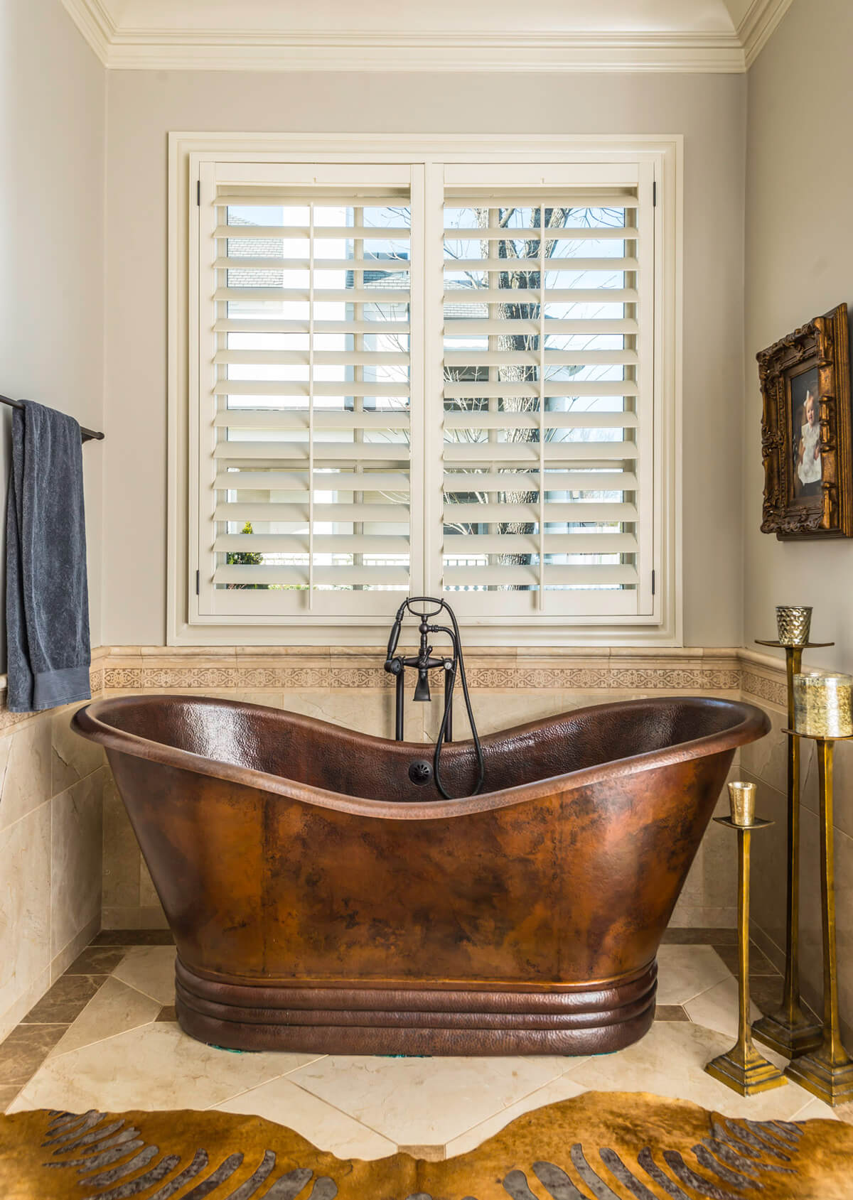
This real copper soaking tub was added to the master bathroom to replace the boring old inset tub. What a fun, and unexpected, one-of-a-kind look!

